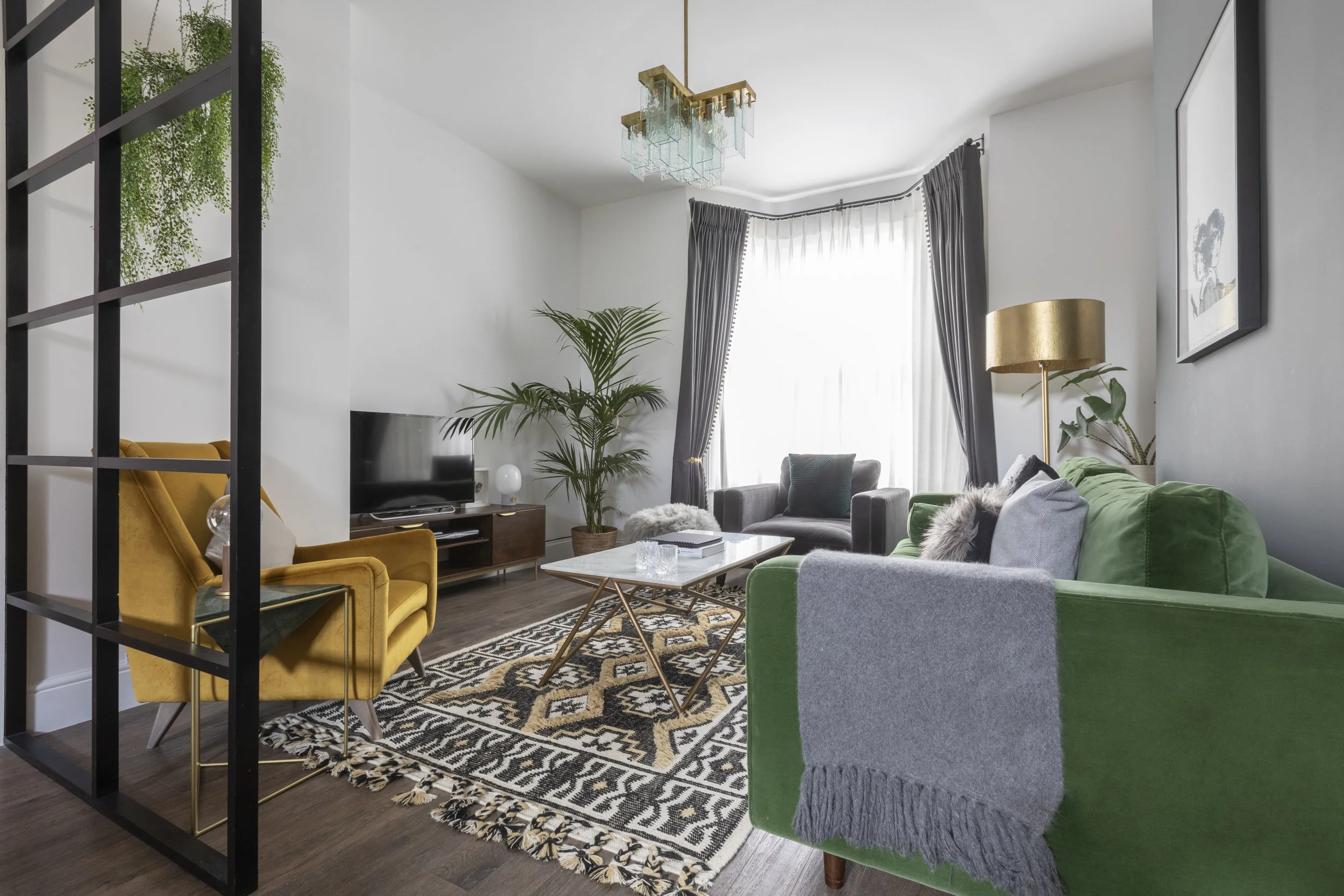
The Parisian Mid Century Livingroom
Here we have an absolute show stopper! With one foot in Paris and one in Berlin, the style of this room, based in the lovely village of Crouch End, is truly eclectic.
The success of this room, visually and functionally, lies in the amazing crittal window inspired room divider. Due to the unusually long narrow proportions of this room, the aim was to create definition…..two rooms within a room- separate the spaces but maintain the social connection.
After thorough discussions about the functions of all rooms in the house, the decision was made to create a formal dinning area alongside the livingroom.
The divider, designed with equal proportions and a graphic industrial charm, had no need to block out noise, so we were able to lose the glass element and have it made simply out of wood and painted black.
In the sitting area, pops of emerald green and honey mustard velvets, work beautifully alongside the harder textures of marble and brass.
And in the dinning area, the gorgeous tear drop glass pendants hovering delicately above a concrete and brass dinning table define the space. Ghost chairs and a scattering of shaggy sheep skin seat pads work beautifully against the backdrop of a huge gold antique Parisian floor mirror…. A great way of making the narrow space feel wider.
Photography: www.fionamurry.com

The brief for this space, within pop-up design experience called DreamHouzz, was challenging but so much fun. A creative professional couple working in east London who love to travel. Design is important to them and they have a spare room for dressing so this space is their sanctuary. They love animals and have a mini dachshund who shares their bed with them. They lead busy lives and wanted a vibrant bedroom to set them up for their day. They love to read with a drink to relax, away from their phones or TV. This is a non tech zone.
The Wallpaper is a witty nod to their beloved animal companion. Touching on the line drawing trend that is having a big moment. The arches of the bed nod to their love of European design and adds a soft line to the industrial setting of their home. The space showcases modernist aspects of design and has vibrant colour to match the energy and open mindedness of the clients. The Wallpaper adds a witty edge to show that the couple don’t take themselves too seriously
The space is quite long but we zoned it to make a bold statement of the bed by the window and give space for a breakout chill space, for reading with a nightcap before bed. The biggest challenge, as always in our work as interior designers, was staying true to the strong architectural roots of the space, whilst allowing the clients personalities to shine. The organic curves of the sofa perfectly balance the hard industrial elements of the setting. It’s large size gives a luxurious hotel feel to the space. Perfect for relaxing before bed with your partner or on a Sunday morning with a flat white.


